wilde.amsterdam
A UX/UI and strategy project for WildeAmsterdam, focused on repositioning the website around a clearer story, stronger information architecture, and a single conversion path. The new direction made the offer easier to understand and helped increase clientele by 18%.

Client
WildeAmsterdam
Year
2025
Project type
UX/UI Design, Strategy & Campaign Design
Credits
Wander Wierda, Jan Hein de Wilde
UX / UI
Strategy
Repositioning
Campaigns
Problem
The website lacked a clear way to organize the offer & conversion, guide people through the information, or create a confident next step. It was an initial poor design, no meaningful calls, and too much friction between interest and action.
Role & Scope
I led the UX/UI direction, repositioning, information architecture, campaign thinking, prototyping, and iteration. The work covered the complete website experience.
Outcome
The redesigned experience created an insane improvement in conversion and contributed to an 18% increase in clientele. The work also gave WildeAmsterdam a clearer way to communicate its value and a foundation for future campaign pages.

Context & Constraints
The challenge was not simply to align the website with the proposition. It was to make the offer understandable enough that the right people could act on it.
◉
The website generated little to no conversion and did not create enough momentum toward a call or enquiry.
◉
The information was difficult to organize into a unifying story that users could follow.
◉
The brand was not yet widely known, so the experience had to earn trust through clarity and action rather than visibility alone.
◉
The system needed to support future campaign pages and localized product definitions without losing the core story.


Process
01
Discovery & Problem
We started by naming the real problem: the website was not converting, there were no meaningful calls, and the design did not help people understand what to do next.
02
Research & Principles
I created multiple versions of the website direction and asked users through a short questionnaire how they understood the flow of information.
03
Ideation & Creation
The first concepts were built from prepared blank placeholder sections. This kept the early work focused on structure and flow.
04
Prototyping & Validation
We prototyped different models to understand where users looked, what they ignored, and where the story broke down. Heatmap thinking and quick comparisons made the weak points visible before launch.
05
Iteration & Refinement
After the positive result, we continued refining the experience post-launch instead of treating the first release as the finish line.
Design Decision
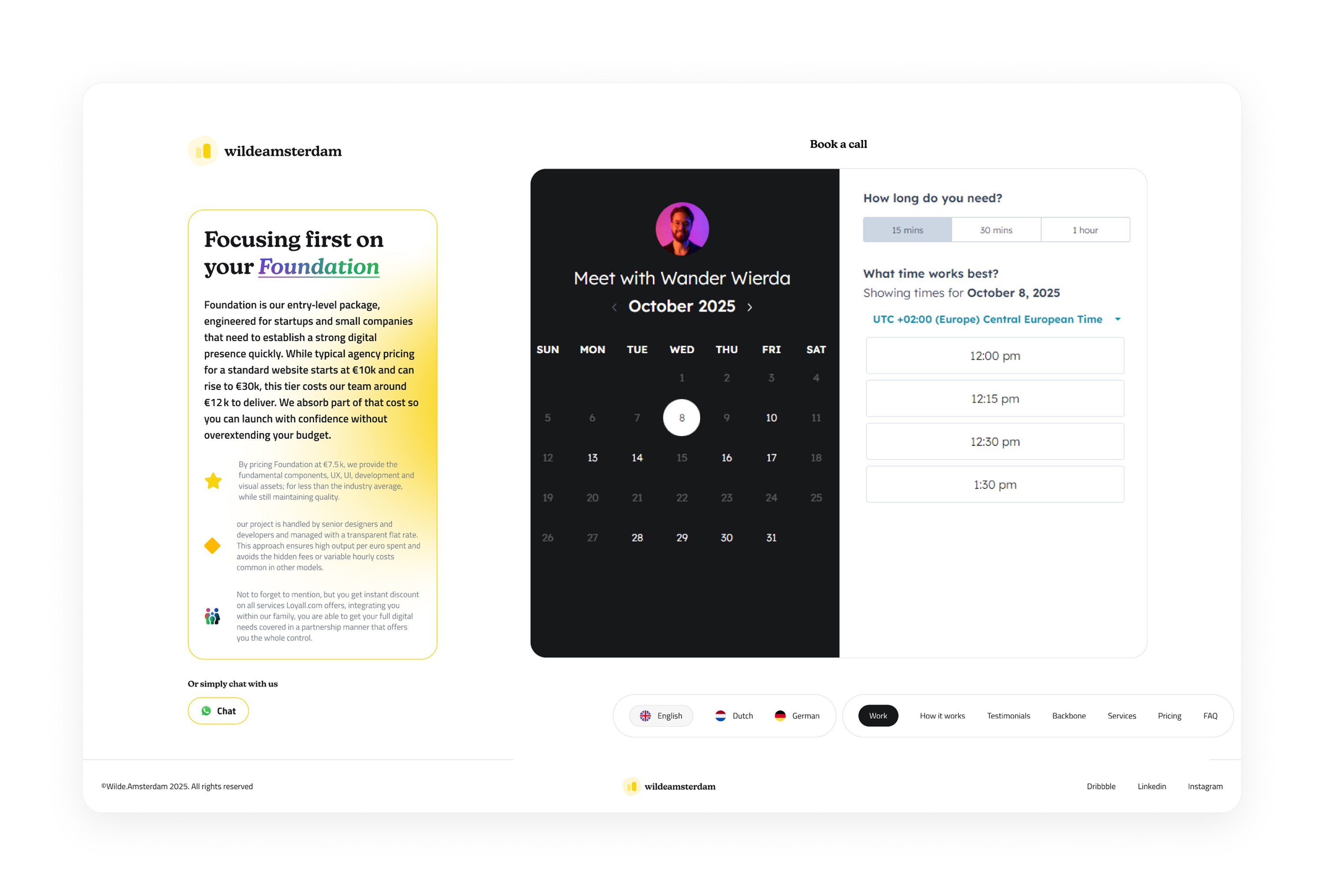
One Clear CTA vs CTAs Everywhere
The main conversion question was whether to place calls to action throughout the entire website or create one stronger, more memorable conversion point.
Option A
Multiple CTAs spread across the website
Option B
One persistent CTA section aligned to the left
Chose: One highlighted CTA section
I chose one CTA section that stayed aligned to the left and remained easy to reach. Highlighted in WildeAmsterdam branding, it created a consistent action without competing with every part of the story.

Design Decision
Business Visibility vs User Priority
The brand needed visibility, but putting the business everywhere risked making the story feel self-focused before the user understood the value.
Option A
Lead with brand visibility and business messaging
Option B
Lead with user priority, story, and action
Chose: User priority and story
Because the brand was not yet widely known, I decided that actions needed to speak louder than branding. The experience prioritizes what users need to understand and do before asking them to engage with the company.

Learnings
◉
Prioritizing user feedback created more useful ideas than starting from assumptions. The questionnaire and prototype reactions opened up directions we would not have found in a purely internal process.
◉
A single, repeated conversion path can create more confidence than many competing CTAs. Consistency made the next step easier to recognize and easier to trust.
What I'd do differently
◉
I would create a better pricing matrix so the relationship between the offer, the investment, and the expected value was easier to compare.
◉
I would allocate more time to pricing exploration. A clearer pricing model could have defined the product even further and made the conversion story more concrete.

Next project
